Alhambra Cheer Club
The Project Challenge
The challenge was to redesign a local, amateur-made sign in a way that elevated its visual communication without losing its community-driven authenticity and approachable tone.
My Approach
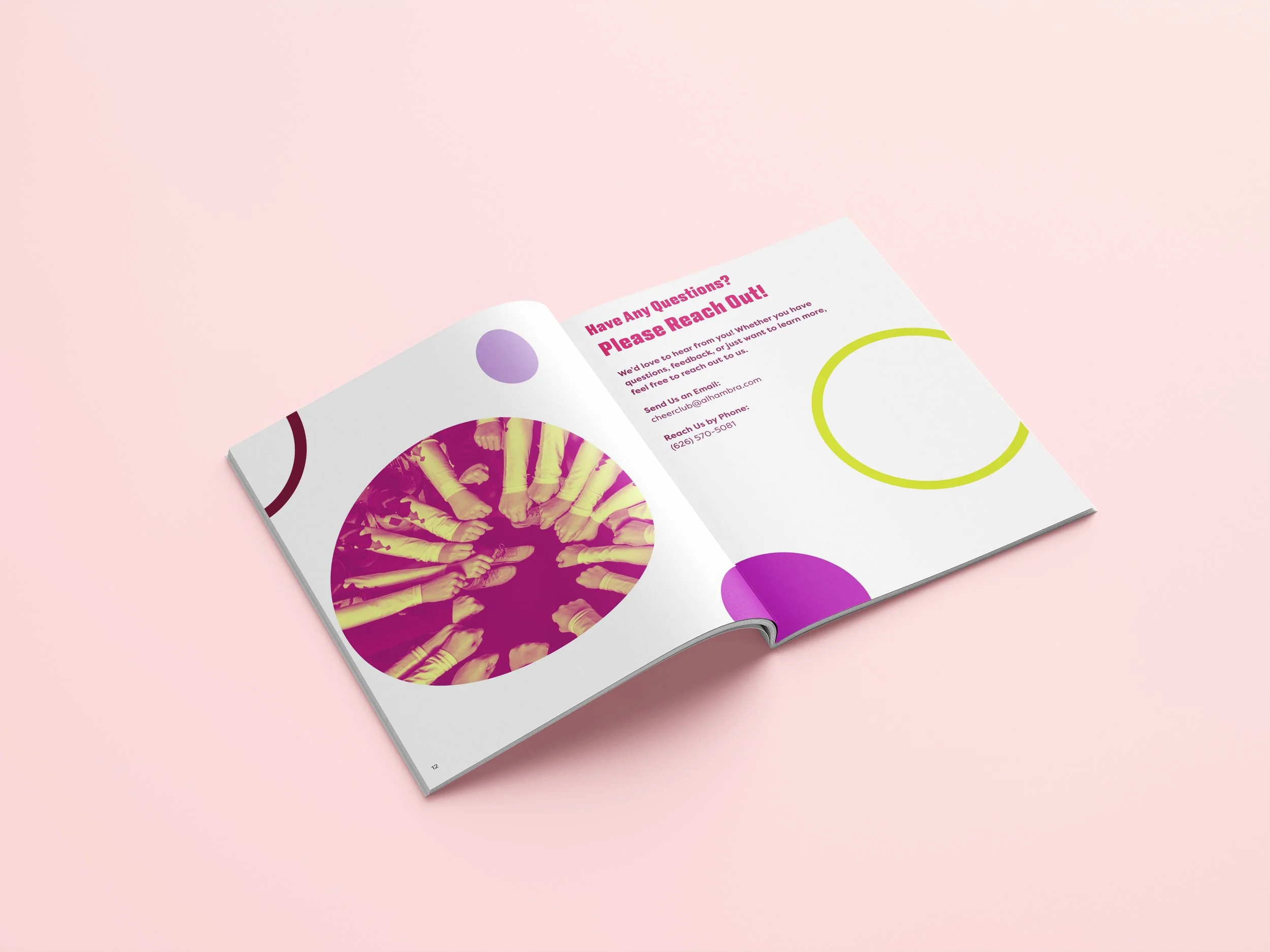
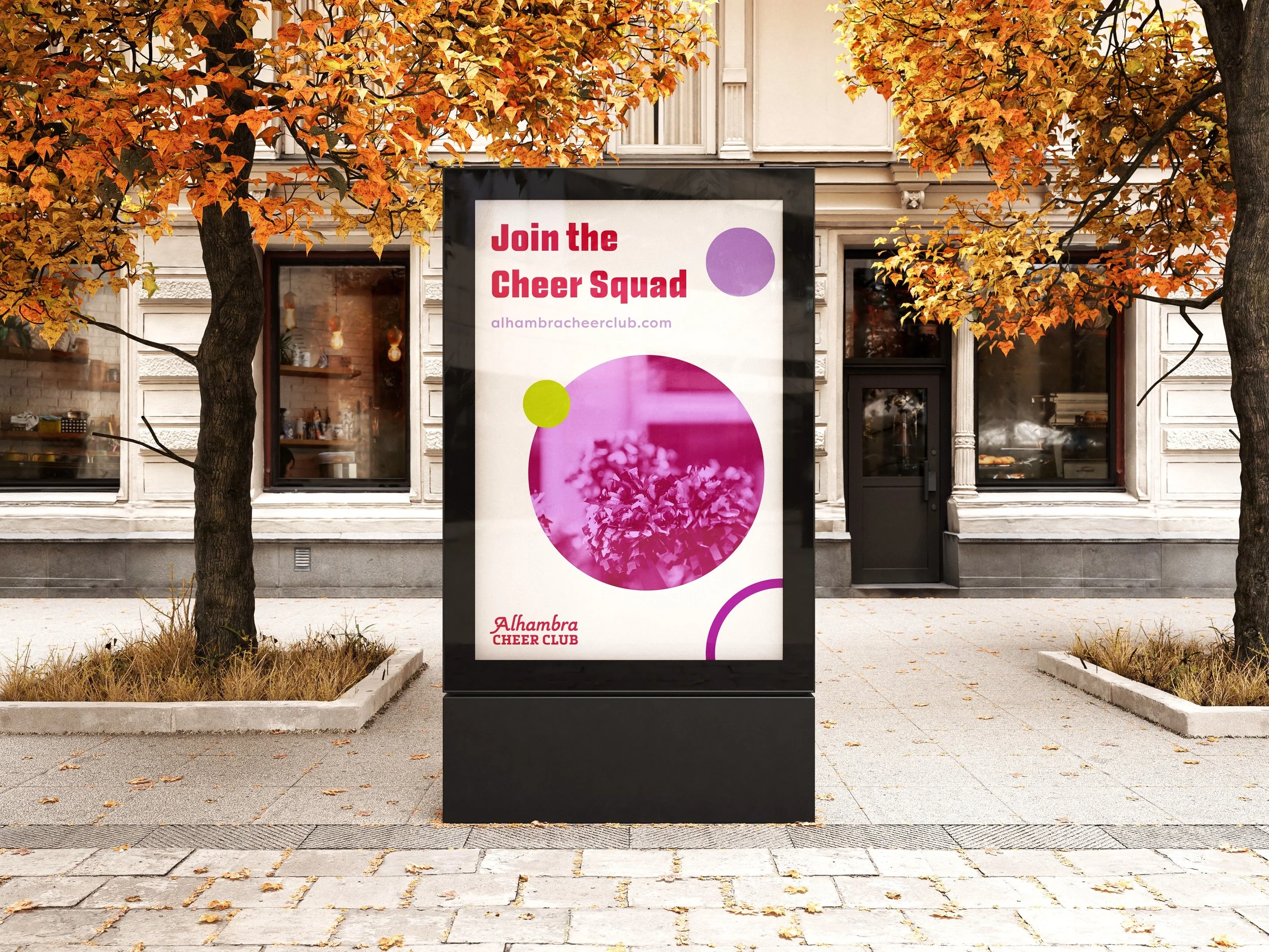
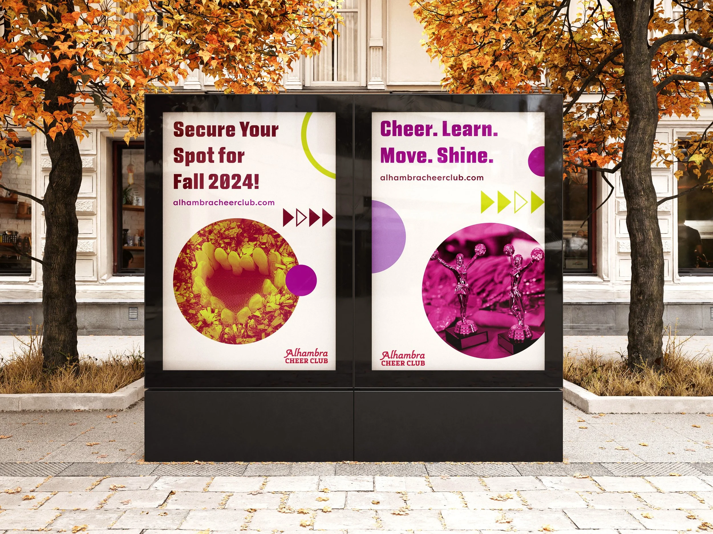
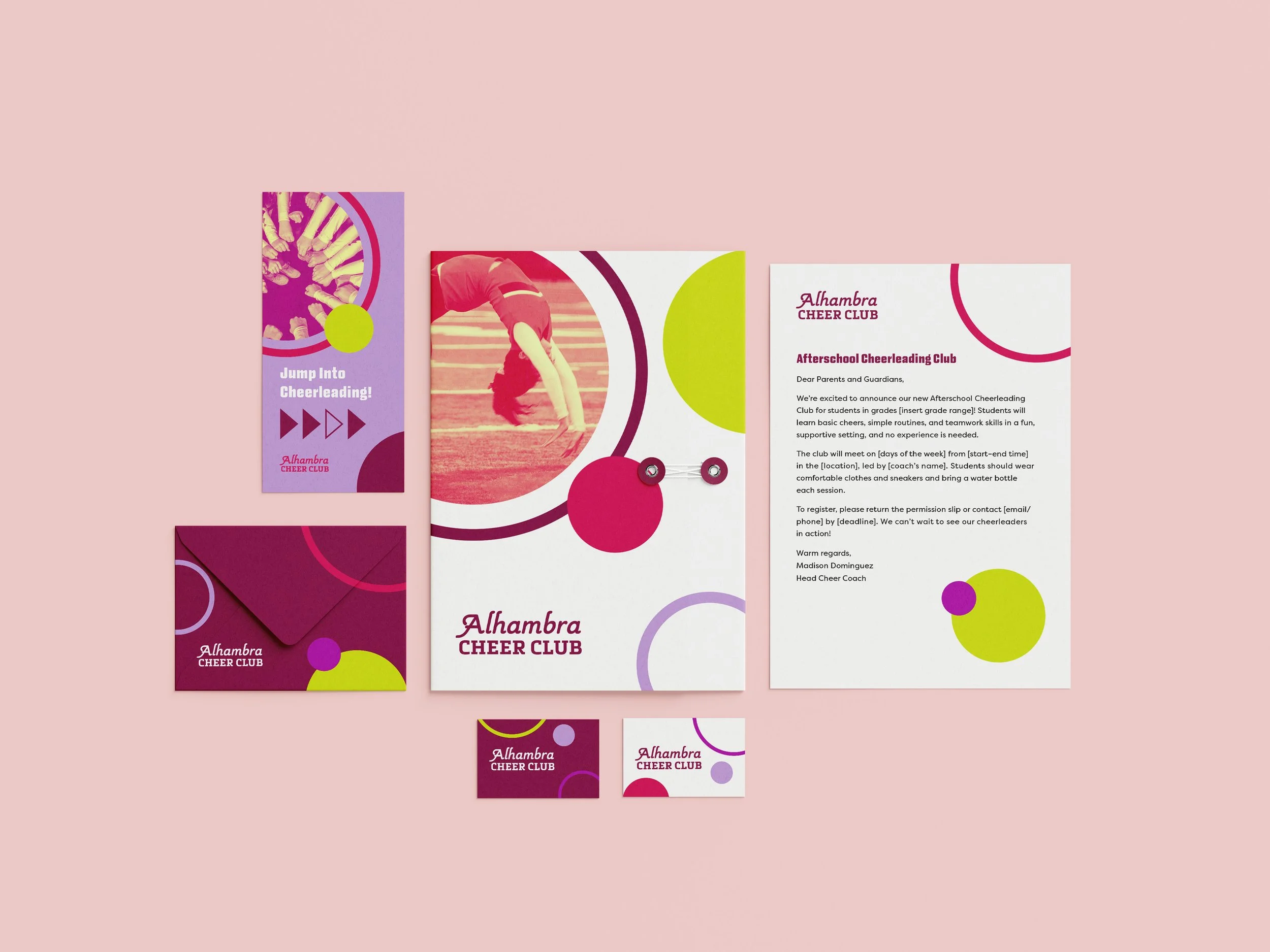
The approach focused on understanding the original sign’s intent—its sense of energy, inclusivity, and accessibility— and reinterpreting those qualities through a refined design system. Bold typography, dynamic graphics, and a playful yet organized layout were used to create cohesion while keeping the grass-roots spirit intact. The result was a visual language that amplified the message rather than replaced it, allowing design to listen and communicate with genuine local character.